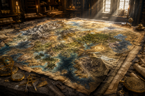

The Full-Stack Campaign: Armor and Appearance: CSS Layout Without Chaos
Editor’s Note
This article was originally published on RandomThoughtsInTraffic.com and has been extensively revised and expanded for its inclusion in StackNScroll. While the original introduced CSS layout through a fantasy-inspired perspective, this edition builds on those ideas with a deeper exploration of front-end architecture, examining the relationship among semantic HTML, Flexbox, Grid, responsive design, visual hierarchy, and maintainable styling systems. New material explores the engineering decisions that shape resilient layouts, emphasizing why experienced developers make particular architectural choices rather than simply demonstrating CSS techniques. The goal of this revised edition is to move beyond individual properties and help readers develop the mindset required to build interfaces that remain understandable, adaptable, and maintainable throughout an application’s life cycle.
Forging Armor That Lasts
One of the first lessons I try to teach newer developers is that CSS is not about making a website look attractive. Presentation certainly matters, but appearance alone has never been the true objective of professional front-end development. Our responsibility is to build interfaces that continue serving users as content grows, requirements evolve, and new features are introduced throughout the lifetime of an application. A layout that succeeds only under perfect conditions has not truly succeeded. Like a master armorer forging equipment for a long campaign rather than a ceremonial tournament, we are building something that must continue to perform after countless encounters with the unexpected.
Throughout this campaign, we have been constructing our kingdom one layer at a time. In The First Map: How the Browser Shapes the World, we explored how browsers transform HTML into a living document that users can navigate and understand. In The Bones of the Realm: Writing Semantic HTML That Holds, we discovered that meaningful markup leads to better accessibility, easier maintenance, and clearer communication among developers. Those lessons gave our kingdom its skeleton. CSS now provides its armor, roads, banners, great halls, marketplaces, and every other visible element that enables people to live comfortably within the realm we have built. Strong presentation has never been separate from strong structure because lasting craftsmanship always begins with a solid foundation.
Many developers begin learning CSS as though it were simply another collection of properties that must be memorized. They study margin, padding, display, position, and width individually, believing that mastering enough declarations will eventually produce professional layouts. That approach often succeeds in tutorials and personal projects, but it becomes increasingly fragile as applications grow and additional developers contribute to the codebase. Mature front-end engineering demands a different perspective. Instead of asking which property moves an element into place, seasoned engineers ask how every part of the interface should cooperate to support the overall design. That subtle shift transforms CSS from a collection of visual tricks into an exercise in software architecture.
One pattern I have repeatedly observed while reviewing production code is that layout problems are often solved one component at a time. Each solution appears reasonable in isolation, yet every adjustment introduces another exception somewhere else in the stylesheet. After enough exceptions accumulate, the code becomes difficult to understand because every rule exists to compensate for an earlier decision. I have reviewed applications in which adding a single navigation link required modifications across five different selectors because the layout had been built on fixed assumptions rather than flexible relationships. The CSS itself was not especially complicated. The architecture behind it simply left no room for growth.
Preparing an adventuring party offers a useful comparison. A wise quartermaster does not simply hand every traveler the heaviest suit of armor available and hope for the best. Scouts require mobility, clerics carry supplies, archers depend upon freedom of movement, and defenders willingly accept heavier armor because they expect to stand on the front line. Every piece of equipment serves a specific purpose within the larger mission. Layout decisions deserve exactly the same level of preparation. Before writing a single CSS rule, consider the responsibilities each component must fulfill and the relationships it must maintain throughout the application’s lifetime.
This philosophy represents one of the defining differences between developers who simply write CSS and engineers who design front-end systems. Individual declarations certainly matter, but they only become truly effective when they support an intentional architecture. Just as armor is forged to protect a knight rather than impress an audience, every layout decision should strengthen the application instead of merely decorating it. Once that mindset takes hold, CSS becomes far less mysterious because every rule serves a deliberate purpose within a much larger design.
The next step is understanding the environment in which that armor must operate. Before we can build dependable layouts, we must first understand the rules governing the world around them. Fortunately, the browser already provides a remarkably consistent foundation. Much of becoming proficient with CSS is learning to recognize and build upon those existing rules rather than attempting to replace them.
Respecting the Rules of the Realm
One of the most valuable discoveries I made early in my career was realizing that the browser is remarkably predictable. At first, I believed CSS was constantly working against me because elements rarely appeared where I expected them. Looking back, I realized the browser had been following its rules with remarkable consistency all along. The unpredictable part of the equation was my own understanding. Once I stopped fighting the layout engine and began learning its expectations, CSS became dramatically easier to reason about.
Every HTML document begins in what is known as normal flow. Block elements naturally stack from top to bottom. Inline elements occupy space within lines of text. Parent containers expand to contain their children, and content determines the height of most elements. These behaviors are not arbitrary restrictions imposed by browser vendors. They are sensible defaults that solve an enormous number of layout problems before we ever write a line of CSS. Professional developers learn to build on those defaults rather than immediately replace them, because doing so allows the browser to perform the work it was designed to do.
One habit I encourage every front-end developer to develop is observing what the browser already does before attempting to change it. If the default behavior already solves the problem, additional CSS often introduces unnecessary complexity. Newer developers sometimes assume that writing more CSS demonstrates greater expertise. Experience consistently teaches the opposite lesson. Some of the strongest layouts I have built relied on surprisingly little code because the browser was already handling much of the work. Understanding those defaults reduces complexity, improves maintainability, and makes future enhancements significantly easier.
Consider the following HTML.
</> HTML

<main class="content">
    <article class="lesson">
        <h2>The Guild Hall</h2>

        <p>
            Every apprentice begins the campaign by learning the customs
            before accepting the first quest.
        </p>
    </article>

    <article class="lesson">
        <h2>The Marketplace</h2>

        <p>
            Merchants exchange knowledge, equipment, and stories gathered
            throughout the kingdom.
        </p>
    </article>

    <article class="lesson">
        <h2>The Castle</h2>

        <p>
            Strong foundations allow every tower and wall to remain stable
            for generations.
        </p>
    </article>
</main>
Before writing any CSS, pause for a moment and consider what the browser already understands. Each <article> is a block-level element, so the browser naturally places one beneath the previous one. Each heading introduces its section, and each paragraph flows naturally beneath its heading. Without a single line of CSS, the document is already readable because HTML provides structure before presentation ever enters the picture.
Now we can enhance that structure rather than replacing it.
</> CSS

.content {
    max-width: 70rem;
    margin: 0 auto;
    padding: 2rem;
}

.lesson {
    margin-bottom: 2rem;
    padding: 1.5rem;

    border: 1px solid #d7d7d7;
    border-radius: 0.5rem;

    background-color: #ffffff;
}
Notice what this stylesheet actually accomplishes. We improve spacing, readability, and visual separation between sections of content. We never instruct the browser to stack the articles because it already performs that responsibility exceptionally well. Mature CSS often contains fewer declarations than beginner CSS because it relies upon existing browser behavior whenever possible. Learning what not to write is every bit as valuable as learning another property. The less time we spend fighting the browser, the more time we can spend designing layouts that genuinely improve the user experience.
This principle appears repeatedly throughout professional front-end development. The browser already understands documents, relationships, and reading order. Our responsibility is not to replace that understanding but to enhance it thoughtfully. Every time we cooperate with the browser instead of competing against it, our code becomes simpler, more resilient, and easier for the next developer to understand.
The Armor Is Not the Knight
One of the most important lessons from our previous article is that HTML and CSS serve entirely different purposes. HTML defines meaning. CSS defines presentation. They work together continuously, but they should never attempt to replace one another. When those responsibilities become blurred, both the codebase and the user experience become more difficult to maintain.
Imagine a castle where every important room is identified only by the color of the banner hanging above its entrance. Visitors might eventually memorize the colors, but the castle itself communicates very little. Replace the banners, and suddenly nobody knows where the throne room, the armory, the kitchens, or the library belongs. A well-designed kingdom gives every room a purpose regardless of decoration. The banners reinforce that purpose rather than creating it. HTML functions in exactly the same way. A heading remains a heading even if every stylesheet disappears. Navigation remains navigation whether it is displayed across the top of the page or tucked neatly behind a mobile menu.
This separation has practical consequences far beyond cleaner architecture. Screen readers rely on semantic HTML rather than visual appearance. Search engines evaluate document structure instead of decorative styling. Developers joining a project understand your intentions more quickly when the markup communicates purpose before CSS adds personality. Every time presentation replaces semantics, the application becomes slightly more difficult for both people and machines to understand.
Modern CSS gives us extraordinary flexibility through technologies such as Flexbox and Grid, allowing us to rearrange content almost effortlessly. That flexibility is powerful, but it should be exercised thoughtfully. Keyboard navigation, assistive technologies, and search engines still experience the underlying HTML structure rather than the visual arrangement presented on the screen. If the presentation tells one story while the document tells another, confusion inevitably follows. Strong layouts allow CSS to enhance semantic structure rather than disguise it.
This distinction becomes increasingly important as projects mature. A component that is semantically correct can often be restyled repeatedly throughout the lifetime of an application without requiring changes to its HTML. Conversely, components whose structure exists only to satisfy visual requirements often become difficult to maintain because every redesign forces changes to both the markup and the stylesheet. Separating responsibilities allows each layer to evolve independently, reducing complexity while increasing flexibility.
Once semantics establishes the purpose of every room within the kingdom, the next challenge is arranging those rooms into a place that people can navigate naturally. That requires us to stop thinking like decorators and begin thinking like architects. Before choosing Flexbox, Grid, or any other layout system, we must first understand how experienced builders design an entire kingdom instead of focusing on individual stones.
Planning the Castle Before Laying Stone
The moment semantics establishes the purpose of every room within the kingdom, a new question naturally follows. How should those rooms relate to one another? This is where many developers instinctively begin moving elements around the page, experimenting until the layout looks correct. I made the same mistake early in my career. Over time, I learned that the best layouts rarely begin with CSS at all. They begin with understanding relationships.
As projects become larger, I encourage developers to stop thinking about individual elements and begin thinking about systems. A navigation bar is not simply a collection of links. It represents a relationship between branding, navigation, search, authentication, and user actions. Likewise, a dashboard is not merely several boxes arranged side by side. It is an organized relationship between information that should remain visible, information that should expand naturally, and information that must gracefully adapt as the available space changes.
This shift in perspective influences every design decision that follows. Instead of asking how to move a button twenty pixels to the right, ask why the surrounding elements require additional space in the first place. Instead of centering a single card, think about how every card within the collection should behave when another card is added or when the viewport becomes smaller. Those questions naturally produce layouts that remain understandable months or even years after they were originally written. They also produce code that future developers can extend without first having to unravel a maze of exceptions.
Castle architects never begin construction by randomly placing rooms wherever empty space happens to exist. They first determine where travelers enter, how defenders protect the walls, where merchants gather, how supplies move throughout the kingdom, and how citizens experience the city itself. Individual rooms certainly matter, but they only make sense because they contribute to a larger design. CSS layout deserves exactly the same level of planning. Once the relationships become clear, selecting the appropriate layout technique is remarkably straightforward because every decision supports the architecture rather than competing with it.
One lesson I have learned repeatedly throughout my career is that tools rarely solve architectural problems. Developers sometimes spend hours debating whether Flexbox or Grid is the better solution when the real issue is that nobody has clearly defined the relationship they are trying to create. Master builders rarely begin by asking which hammer they should use. They begin by studying the blueprint. Once the design is understood, the proper tools become obvious.
The Marching Orders of Flexbox
With the blueprint complete, construction can finally begin. This is often the point where developers become excited because they can finally start arranging elements on the screen rather than just planning them. I certainly felt that way when I first learned CSS. Looking back, I realize I was eager to write code before I had fully considered the relationships I was trying to build. Experience has taught me that thoughtful planning almost always produces simpler, more maintainable stylesheets.
One of the most significant improvements to CSS in the last decade has been the introduction of Flexbox. Before it became widely supported, developers often relied on floats, clearing techniques, or even table-based layouts to achieve relatively simple designs. Those approaches certainly worked, but they often required additional code just to get the browser to do something that should have been straightforward. Flexbox changed that conversation by allowing us to describe relationships rather than manually calculate positions. It encourages developers to think less about moving individual elements and more about organizing groups of related content.
The most valuable lesson I can offer about Flexbox is that it was designed to solve one-dimensional problems exceptionally well. Whether the primary direction runs horizontally or vertically, every child element participates in the same coordinated flow. Once you begin thinking about alignment instead of positioning, the system becomes much easier to understand. Rather than asking where a particular button belongs, you begin asking how the entire group should behave together. That change in thinking often marks the transition from writing CSS that works today to engineering CSS that remains dependable for years.
Consider a common application header. Before looking at the CSS, note that the HTML conveys only the content’s structure. It says nothing about where the navigation should appear or how the heading should align with it. Those presentation decisions belong entirely within the stylesheet.
</> HTML

<header class="site-header">
    <h1>Full-Stack Campaign</h1>

    <nav>
        <ul class="navigation">
            <li><a href="#">Home</a></li>
            <li><a href="#">Campaign</a></li>
            <li><a href="#">Quests</a></li>
            <li><a href="#">Resources</a></li>
        </ul>
    </nav>
</header>
Using Flexbox, the stylesheet communicates relationships instead of coordinates.
</> CSS

.site-header {
    display: flex;
    justify-content: space-between;
    align-items: center;

    padding: 1.5rem 2rem;

    background-color: #253142;
    color: white;
}

.navigation {
    display: flex;
    gap: 1.5rem;

    list-style: none;
    margin: 0;
    padding: 0;
}

.navigation a {
    color: inherit;
    text-decoration: none;
}
Notice what this code does not contain. There are no calculations determining exactly where each navigation item should appear. There are no fixed coordinates forcing the logo and navigation into alignment. Instead, we describe the relationship between the elements and allow the browser to perform the calculations. As the navigation grows or the logo changes, the layout continues to behave predictably because the rules describe cooperation rather than placement. That is precisely what makes Flexbox such a powerful layout system.
During code reviews, I often encounter layouts built by adjusting individual elements until everything finally lines up. They usually look correct when the pull request is submitted, but they become increasingly fragile as additional features are introduced. Someone eventually adds another navigation item or replaces a short label with a longer one, and suddenly the carefully adjusted layout begins drifting apart. Flexbox reduces many of these problems by encouraging developers to build flexible layouts rather than relying on fixed assumptions.
Understanding the strengths of Flexbox naturally leads to another question. If Flexbox organizes relationships so effectively, should it become the solution for every layout problem? The answer reveals another important lesson about choosing tools wisely.
Raising the Castle Walls with CSS Grid
As useful as Flexbox is, there comes a point when arranging a single row or column is no longer enough. Entire applications need structure. Dashboards require sidebars. Administrative portals need headers, navigation regions, content areas, utility panels, and footers. Trying to solve those problems exclusively with Flexbox is rather like asking a skilled carpenter to design an entire castle. The carpenter is an expert at building individual rooms, but someone still has to determine where those rooms belong within the kingdom.
That is where CSS Grid changes the conversation. Instead of arranging content along a single direction, Grid allows us to define the structure of an entire page. Rows and columns become deliberate architectural decisions rather than accidental consequences of nested containers. Continuing our campaign metaphor, Flexbox helps organize the soldiers marching through the courtyard. Grid determines where the courtyard belongs relative to the walls, towers, gates, and great hall. It establishes the kingdom before worrying about the details inside it.
Consider a common application layout. As before, the HTML focuses entirely on the document structure. The layout itself will be determined entirely by CSS.
</> HTML

<div class="layout">
    <header>Guild Headquarters</header>

    <aside>
        Navigation
    </aside>

    <main>
        <h2>Current Quest</h2>

        <p>
            Complete the campaign by building maintainable layouts.
        </p>
    </main>

    <footer>
        StackNScroll
    </footer>
</div>
Grid allows us to express that architecture directly.
</> CSS

.layout {
    display: grid;

    grid-template-columns: 16rem 1fr;
    grid-template-rows: auto 1fr auto;

    min-height: 100vh;
}

header {
    grid-column: 1 / 3;
    padding: 1.5rem;

    background: #253142;
    color: white;
}

aside {
    padding: 1.5rem;
    background: #ececec;
}

main {
    padding: 2rem;
}

footer {
    grid-column: 1 / 3;
    padding: 1rem;

    background: #253142;
    color: white;
}
This approach accomplishes far more than arranging content. It communicates the application’s architecture. Another developer can immediately understand that the header spans the page, the sidebar occupies its own region, and the main content expands naturally into the remaining space. The stylesheet documents the design while simultaneously implementing it, making future maintenance significantly easier.
Choosing the Right Tool for the Job
One misconception I encounter frequently is the belief that developers must choose between Flexbox and Grid. Tutorials often reinforce this misunderstanding by presenting them as competing technologies, but that has never reflected how professional engineering teams approach layout. The better question is not which one is superior. The better question is which one solves the current problem most naturally. Once we understand the strengths of each system, we stop viewing them as competitors and begin treating them as complementary tools within the same engineering toolkit.
Most production applications I have worked on use both technologies together. Grid establishes the page’s architecture by defining major regions such as headers, navigation, content, sidebars, utility panels, and footers. Once those regions exist, Flexbox organizes the smaller relationships inside each one. Navigation menus, button groups, forms, media objects, cards, and toolbars all benefit from Flexbox because they primarily organize content along a single direction. Each technology performs the work it was specifically designed to perform, and each becomes more valuable because the other exists.
Think about the craftsmen responsible for building our fantasy kingdom. The mason cuts stone for the castle walls. The carpenter builds doors, roofs, and furniture. The blacksmith forges armor, hinges, and tools. The glassmaker fills windows with stained glass that allows light into the great hall. None of these craftsmen replaces another because each contributes different expertise to the same project. Modern CSS works exactly the same way. Grid and Flexbox become remarkably powerful once we stop asking which one should replace the other and instead allow each to perform the responsibility it was designed to fulfill.
The real lesson is not about Flexbox or Grid. It is about learning to recognize the nature of the problem before selecting the solution. Professional developers spend surprisingly little time arguing about tools because they understand that architecture determines the choice long before the first line of CSS is written. Once those architectural decisions are in place, attention naturally shifts toward another challenge. How do we build layouts that continue serving users as our applications, teams, and requirements inevitably evolve?
Do Not Nail Every Shield to the Wall
As developers become more comfortable with modern layout systems, another temptation often appears. It becomes easy to reach for positioning whenever something seems slightly out of place. CSS certainly provides properties such as position, top, left, right, and bottom, but those tools exist to solve very specific problems rather than becoming the foundation of every layout. Overusing them often creates interfaces that appear correct today while quietly accumulating maintenance problems for tomorrow. Good engineering requires knowing not only how to use powerful tools, but also when to leave them on the workbench.
Positioning removes elements from the document’s normal flow. Sometimes that behavior is exactly what we want. Notification badges, floating action buttons, modal dialogs, tooltips, and similar interface elements intentionally exist outside the surrounding layout. Problems arise when positioning becomes the primary strategy for arranging entire pages rather than remaining a specialized technique reserved for specific components. Like every tool in a craftsman’s workshop, positioning becomes most valuable when applied deliberately rather than habitually.
Consider a profile card with a notification badge. The HTML remains simple because its responsibility is only to describe the content’s structure.
</> HTML

<div class="profile-card">
    <span class="badge">3</span>

    <h3>Guild Master</h3>

    <p>
        New quests are waiting.
    </p>
</div>
The positioning belongs entirely within the stylesheet.
</> CSS

.profile-card {
    position: relative;

    padding: 2rem;

    border: 1px solid #cccccc;
    border-radius: 0.5rem;
}

.badge {
    position: absolute;

    top: 1rem;
    right: 1rem;

    width: 2rem;
    height: 2rem;

    display: flex;
    justify-content: center;
    align-items: center;

    border-radius: 50%;

    background: crimson;
    color: white;
}
This solution works because the badge has one clearly defined responsibility. It intentionally floats above the card while remaining anchored to its parent. The positioning is easy to understand because it solves a specific problem rather than controlling the entire page. Applying the same technique everywhere would resemble nailing every shield in the armory to the castle walls simply because there happened to be empty space. It might appear organized for a moment, but it quickly becomes impossible to rearrange when the needs of the kingdom inevitably change.
The strongest layouts rely on positioning sparingly. They allow normal flow, Flexbox, and Grid to do what they were designed to do while reserving positioning for situations where it genuinely adds value. That discipline may not seem exciting while writing CSS, but it becomes one of the characteristics that separates maintainable front-end architecture from temporary visual fixes. As your applications become larger, resisting unnecessary complexity becomes just as important as learning new techniques.
Build for Tomorrow’s Campaign
Every software project eventually teaches the same lesson. Layouts rarely remain unchanged for very long. Marketing teams request larger images, product owners introduce additional controls, accessibility improvements require larger text, and users inevitably enter content that nobody anticipated during development. Every one of these changes challenges assumptions that once seemed perfectly reasonable. Developers who build only for today’s requirements often discover that tomorrow’s feature request requires rebuilding large portions of the interface.
Seasoned engineers approach layout differently. Rather than creating pages that appear perfect under ideal conditions, they build systems that continue functioning as conditions evolve. This difference has very little to do with CSS syntax and almost everything to do with an engineering mindset. A successful layout is one that gracefully absorbs change without requiring extensive reconstruction. Flexibility should be treated as a design objective from the very beginning rather than something added after the first release. Every layout decision should answer an important question. How difficult will this be to modify six months from now when another developer inherits the project?
The fantasy world provides another useful comparison. Castle walls are not designed only for calm summer afternoons. They are reinforced because storms eventually arrive. Bridges include generous safety margins because heavier wagons will eventually cross them. Armor includes adjustable straps because the knight wearing it may gain experience, equipment, and responsibilities over the course of a campaign. Good layouts deserve exactly the same preparation. Build for the changes you know will happen, rather than hoping they never arrive.
That philosophy naturally leads to one of the defining characteristics of modern front-end development. If layouts are expected to adapt over time, they must also adapt across the many environments in which users experience the web. Designing for flexibility is not simply a convenience. It is part of designing for longevity.
Armor Must Fit Every Adventurer
Responsive design was once considered an advanced feature that could be added near the end of development. Today, it should be viewed as a fundamental engineering requirement. Users move between desktop computers, laptops, tablets, mobile phones, televisions, and devices that continue to evolve every year. Designing for only one viewport no longer reflects how people experience the web. Every interface should adapt naturally, regardless of available space, because flexibility has always been one of the web’s defining strengths.
Fortunately, modern CSS allows us to approach responsiveness as an extension of our existing layout instead of an entirely separate implementation. Rather than building multiple versions of the same page, we define how relationships evolve as additional space becomes available. The HTML remains unchanged, while the layout adjusts to the environment. This approach produces cleaner stylesheets, reduces maintenance, and creates a more consistent experience for every user. It also reinforces an important engineering principle. The less duplicated code we maintain, the easier it becomes to evolve our applications.
Consider a collection of quest cards displayed within a dashboard. Notice that the HTML remains intentionally simple because responsiveness is not achieved by changing the document structure. Instead, the stylesheet determines how those elements relate to one another as the available space changes.
</> HTML

<section class="quests">
    <article>Quest One</article>
    <article>Quest Two</article>
    <article>Quest Three</article>
    <article>Quest Four</article>
</section>
The layout evolves by changing only the relationship between the cards.
</> CSS

.quests {
    display: grid;

    grid-template-columns: 1fr;
    gap: 1.5rem;
}

@media (min-width: 768px) {
    .quests {
        grid-template-columns: repeat(2, 1fr);
    }
}

@media (min-width: 1100px) {
    .quests {
        grid-template-columns: repeat(4, 1fr);
    }
}
Notice what remains constant throughout every breakpoint. The cards themselves do not change. Their typography, spacing, colors, and structure remain exactly the same. Only their relationship to one another evolves as additional space becomes available. We are not redesigning the page for each device. We are teaching the layout how to behave under different conditions, allowing the browser to perform the work it was designed to do. That philosophy scales far better than maintaining separate layouts for every possible screen size.
Every Rivet Matters
One area that developers frequently underestimate is visual consistency. It is easy to think of spacing, typography, and visual rhythm as purely artistic decisions, but they have a profound effect on maintainability. Every inconsistent spacing value, every slightly different margin, and every unique padding decision becomes another detail that future developers must remember. Small inconsistencies accumulate until a stylesheet becomes a collection of unrelated decisions instead of a coherent design system.
One habit that has served me well is establishing reusable design values before writing significant amounts of CSS. Instead of inventing measurements whenever something feels crowded, I create a spacing scale that defines the rhythm of the entire application. Typography follows similar patterns through consistent font sizes and heading hierarchies. Color palettes become collections of reusable variables rather than isolated hexadecimal values scattered throughout the stylesheet. Every reusable decision reduces future complexity because the design itself begins speaking a consistent language.
A simple spacing system might begin like this.
</> CSS

:root {
    --space-xs: 0.5rem;
    --space-sm: 1rem;
    --space-md: 1.5rem;
    --space-lg: 2rem;
    --space-xl: 3rem;

    --color-primary: #253142;
    --color-surface: #ffffff;
    --color-border: #d7d7d7;
}

.section {
    padding-block: var(--space-xl);
}

.card {
    padding: var(--space-md);
    margin-bottom: var(--space-lg);

    background: var(--color-surface);
    border: 1px solid var(--color-border);
}

.card h2 {
    margin-bottom: var(--space-sm);
}
This approach extends well beyond cleaner CSS. It creates a shared vocabulary for everyone working on the project. Designers, developers, quality assurance engineers, and future maintainers begin speaking the same language because the system itself communicates the project’s design decisions. That consistency quietly improves every subsequent feature while reducing the visual inconsistencies that naturally arise as applications evolve.
Visual hierarchy deserves the same thoughtful attention. CSS is not simply arranging boxes on a screen. It is directing the user’s attention before they consciously decide where to look. Larger headings establish importance. Consistent whitespace separates ideas before the reader processes a single sentence. Color guides attention toward important actions, while contrast ensures that every user can comfortably consume the information being presented. Good interfaces quietly communicate where users should begin, where they should continue, and which actions deserve immediate attention. Effective visual hierarchy reduces cognitive load because people spend less effort deciding where to look and more effort accomplishing their goals. Appearance is not decoration layered on top of functionality. It is another form of communication, which is precisely why thoughtful presentation deserves the same engineering discipline as thoughtful architecture.
From Apprentice to Master Craftsman
Every developer eventually reaches a point where knowing individual CSS properties is no longer enough. Early success often comes from remembering which property solves a particular problem. Professional growth comes from understanding why that solution works, what trade-offs it introduces, and whether it will continue to serve the application several years into the future. Those are very different skills. One helps complete today’s feature. The other helps an entire team maintain a codebase throughout its lifetime.
When reviewing front-end code, I pay less attention to whether the page currently looks correct than I do to how the layout has been constructed. Can another developer understand the relationships without reverse engineering every selector? Will adding another navigation item require significant restructuring? Does the stylesheet communicate purpose through consistent organization? Those questions reveal far more about the quality of a layout than its appearance ever could. Attractive interfaces are easy to admire. Maintainable interfaces are the ones that survive.
This philosophy naturally encourages developers to think beyond individual pages. Components begin sharing layout patterns, spacing systems, typography, alignment strategies, and design tokens. Rather than solving the same problems repeatedly, the application develops a collection of reliable architectural patterns that can be reused across future features. Every consistent decision reduces cognitive load, improves collaboration, and makes the next enhancement easier than the last. That gradual transformation from solving isolated CSS problems to designing maintainable systems is what ultimately distinguishes an apprentice from a master craftsman.
Traps Hidden Within the Dungeon
Every experienced developer carries a collection of lessons learned through mistakes, and CSS has certainly contributed its share to mine. Looking back, very few of those mistakes were caused by a misunderstanding of individual properties. Most resulted from approaching the problem with the wrong mindset. I spent far too much time trying to force the browser toward a specific visual outcome instead of understanding the system it was already following. Once I learned to work alongside the browser instead of against it, the quality of my layouts improved dramatically.
One common mistake is introducing unnecessary wrapper elements whenever a layout becomes difficult. Modern CSS is remarkably capable, and additional containers often increase complexity without providing meaningful value. Before adding another <div>, ask whether the existing HTML already communicates the relationship you need. More often than not, Flexbox or Grid can solve the problem without expanding the document structure. Cleaner HTML and simpler CSS almost always travel together because each reinforces the clarity of the other.
Another frequent issue is combining layout techniques without understanding the responsibilities of each. There is nothing inherently wrong with using Flexbox, Grid, positioning, and even legacy techniques within the same application. Problems arise when developers switch between them simply because something appears difficult rather than because the nature of the problem has changed. Every tool introduces its own strengths, limitations, and expectations. Mixing them without purpose creates layouts that become increasingly difficult to reason about as the application grows.
Developers should also be cautious about hardcoded dimensions. Fixed widths and heights certainly have legitimate uses for predictable assets such as icons, logos, or profile photographs, but applying rigid measurements to larger interface components often creates maintenance problems as content evolves. Likewise, increasing selector specificity whenever a rule fails to apply usually signals that the underlying stylesheet architecture warrants attention. Simpler selectors, supported by thoughtful component design, almost always prove easier to maintain than increasingly complex combinations of overrides.
Perhaps the most dangerous trap of all is solving symptoms rather than causes. I have reviewed stylesheets where dozens of small adjustments accumulated over several years because each developer fixed the visible issue without asking why it appeared in the first place. Negative margins compensated for inconsistent spacing. Absolute positioning corrected alignment that Flexbox could have handled naturally. Additional wrappers appeared because earlier wrappers had become too difficult to manage. Eventually, the stylesheet resembled a dungeon built atop the ruins of older dungeons, where every passage solved yesterday’s problem while quietly creating tomorrow’s. Good engineering requires the patience to identify the underlying cause before reaching for another quick fix.
Armor That Can Be Repaired
One characteristic shared by mature software is that it welcomes change rather than resisting it. New features appear, branding evolves, accessibility standards improve, and user expectations continue to grow. CSS should anticipate these realities instead of assuming today’s interface will remain unchanged forever. Every engineering decision should acknowledge that another developer, perhaps even your future self, will eventually revisit this code. Writing maintainable CSS is an investment in every feature yet to be imagined.
I often compare maintainable CSS to a well-crafted suit of armor. A master blacksmith does not produce equipment that can never be modified. Individual plates can be repaired, straps adjusted, damaged sections replaced, and fittings upgraded without rebuilding the entire suit. The armor survives years of service because it was designed with maintenance in mind from the very beginning. Good front-end architecture follows the same philosophy, embracing change rather than fearing it.
Reusable components, design tokens, spacing systems, and thoughtful layout patterns all contribute to software that grows gracefully over time. Whenever I encounter a stylesheet that has remained understandable through years of active development, I rarely find clever tricks or elaborate hacks. Instead, I find straightforward decisions applied consistently across the entire project. Consistency may not seem exciting while writing code, but it becomes one of the greatest gifts you can leave for the developers who continue the campaign after you.
There is another benefit to this approach that is often overlooked. Maintainable CSS builds confidence throughout an engineering team. Developers become more willing to improve the interface because they trust the architecture that supports it. New features become opportunities rather than risks because the foundation was built to support growth, not merely survive it. Just as well-maintained armor gives an adventurer confidence before entering an unfamiliar dungeon, a well-structured stylesheet gives an entire team confidence every time a new requirement arrives.
Leaving the Armory
Every campaign changes the adventurer in different ways. Some quests reward creativity, while others reward patience, preparation, and discipline. CSS layout firmly belongs in the second category. It rewards developers who invest time understanding relationships before writing declarations and who view every page as part of a larger system rather than an isolated design exercise. Those habits may feel slower at first, but they consistently produce software that remains reliable long after the excitement of the initial implementation has faded.
As we conclude this chapter of The Full-Stack Campaign, it is worth looking back at the road we have already traveled. In The First Map: How the Browser Shapes the World, we learned how browsers interpret the landscape of the web. In The Bones of the Realm: Writing Semantic HTML That Holds, we built semantic foundations that give our applications meaning and strength. Throughout this article, we forged the armor that protects those foundations while learning that thoughtful presentation is every bit as important as thoughtful structure. Each lesson has prepared us for the challenges that lie farther down the road, reinforcing the idea that successful software is built intentionally rather than accidentally.
The fantasy setting throughout this series has never been about replacing engineering with storytelling. Instead, it reminds us that successful kingdoms are built intentionally. Strong walls begin with solid foundations. Skilled armorers forge equipment that endures years of use rather than impressing visitors for a single afternoon. Wise architects think about the entire realm before laying the first stone. Software development follows those same principles. Strong interfaces emerge from thoughtful planning, clearly defined responsibilities, and consistent execution rather than clever shortcuts or last-minute fixes.
Looking back across my career, one lesson has remained remarkably consistent. The browser is not unpredictable. It is remarkably dependable. Once you understand its rules and begin working alongside them instead of against them, CSS becomes less mysterious and far more enjoyable. The objective is not to memorize every property or every edge case. The objective is to develop an engineering mindset that allows you to choose the right tools, build layouts that embrace change, and leave future developers with code they can understand with confidence.
A well-built kingdom is not remembered because its walls never changed. It is remembered because every generation could strengthen them without having to rebuild the realm. I believe the same is true of great software. The applications that endure are not the ones that avoid change. They are the ones whose foundations, architecture, and presentation were designed to welcome it. Together, HTML, CSS, and JavaScript become something greater than any one layer could accomplish alone. Each has a distinct responsibility, but together they create the rich, accessible, interactive experiences that define the modern web.
Next week, our campaign enters an entirely new chapter, The Spark of Adventure. We have mapped the kingdom, strengthened its foundations, and equipped it with dependable armor. Now it is finally time to breathe life into everything we have built.
On Monday, we begin with The First Spell: JavaScript and the Flow of Execution. HTML gave our kingdom its bones. CSS forged its armor and shaped its appearance. JavaScript will provide its heartbeat, transforming a beautiful but silent kingdom into a living realm where every interaction serves a purpose. Every great adventure begins with a single step, and every great full-stack application begins with understanding how that first spell is cast.


You May Also Like

The Full-Stack Campaign: The Bones of the Realm: Writing Semantic HTML That Holds
The Full-Stack Campaign: The First Spell: JavaScript and the Flow of Execution